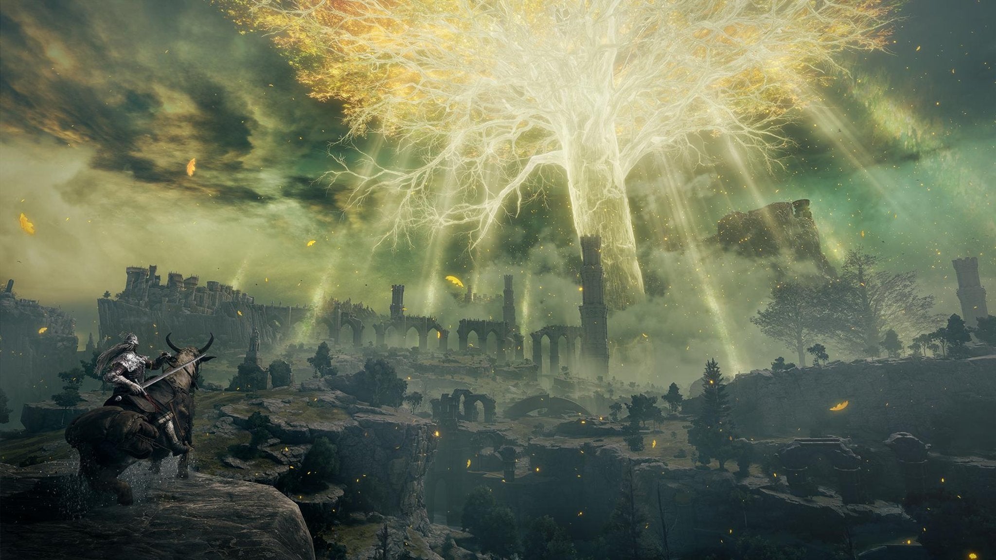
The single most impressive thing about it isn’t its size, though. For my money, the most mind-boggling element of Elden Ring is how deftly it reuses content, how much it gets away with putting the same things in front of you repeatedly, and how despite quite a lot of copy-and-paste work, the game never feels to get old. It’s just a truth of modern game development that assets need to be reused. Every single thing you see in a game – world geometry, enemies, gear – it’s all expensive. When building a game the size of Elden Ring, there’s practically no choice but to reuse a lot of stuff. What makes or breaks a game is often how that reuse feels; if it lands with the end user in a way that is forgivable and forgettable – if noticed at all. In Elden Ring, similar little elements are scattered across the world. Pretty much every shack you find where there are merchants, NPCs, or loot is one of two or three designs, like The Lands Between has a great big Tarnished IKEA that’s providing these ramshackle buildings in flat-pack form. The more basic optional side dungeons are split into one of a few different archetypes – catacombs, caves, and mining tunnels. The geography in each of these is broadly the same with subtle differences depending on the area you’re in – but you never really notice enough to actually care. In some sense, part of why this works is because it’s often contextualized within the world. All of Elden Ring’s churches are identical in design, often with Sacred Tears upgrades found in exactly the same place at every single church. But while they’re all identical, a developer has quietly been into the world editor and adjusted each basic template ever so slightly, with things like the crafting materials and general detritus around the church subtly different in each area, helping to sell it as not an area copied from elsewhere, but something bedded into the area of the game world where it’s found. The side dungeons mentioned before are probably the largest culprit for where the game does feel samey. Catacombs, in particular, are built out of boxy rooms in a modular fashion. In one dungeon, the content reuse was made more obvious by the fact that a room where there’s usually three guillotine-style blades as hazards had been repurposed to only have one blade - but the marks in the walls and floor for the other two blades were still there. The level designer just turned two hazards off. Which is fair enough, really - but I note this as it was the one time where I actively noticed and mentally noted the content reuse. To only really notice one instance in a good hundred hours is very good going, right? Like, of course I noticed things like enemies that get subtle variations, or the game’s dragons, which all have the same broad move set but each have a different elemental affinity (one might breathe fire, another frost, another rot, and so on) - but none of itr was so prominent to draw me out of the experience. As always with this sort of thing, it’s quite difficult to articulate or even pinpoint exactly what it is about this world that makes this sort of content reuse work. But if I had to put my finger on something, it’s about balance. Yes, there’s a lot of stuff reused across Elden Ring’s world – but turn the camera a few degrees in any direction from inside one of those reused churches or what have you and you’ll always see some beautiful, impressive, entirely bespoke building or piece of geometry off in the distance. And, of course, you can go there. This isn’t just cute skyboxes off in the distance: it’s all a real world. It’s all tangible. And so much of it is full of bespoke beauty and horror that it becomes ever easier to forgive when you do see something a little too familiar. Few games really nail this feeling – but Elden Ring is one of them. Given that it’s FromSoftware’s first open world, it’s an incredible achievement. As I start a third save, this time on console, I don’t care that I’ve seen all of this world before. Somehow, it still feels fresh, which is incredible.
.jpg/BROK/resize/690%3E/format/jpg/quality/70/elden_ring%20(3).jpg)
